The Sharpe ratio asks: how much extra return did an investment earn for the ups and downs you had to accept? Two portfolios can earn the same return while giving you very different rides. The Sharpe ratio helps compare them.
What is the Sharpe ratio?
It measures an investment's return above cash, divided by its volatility. Volatility describes how widely returns fluctuate, both upwards and downwards. A higher positive ratio means more return above cash for each unit of fluctuation.
The simplified formula is:
Sharpe ratio = (average investment return − cash return) ÷ volatility
Cash is subtracted because you could earn interest without taking the same investment risk. The ratio measures what you earned beyond that alternative. The cash benchmark is usually a short-term government bill in the same currency, often called the risk-free rate.
A good and bad Sharpe ratio: the same return, different rides
Imagine two portfolios that both earned an average of 8% a year, while the cash benchmark earned 3%. Both earned 5 percentage points more than cash. These are hypothetical figures for the same period and currency.
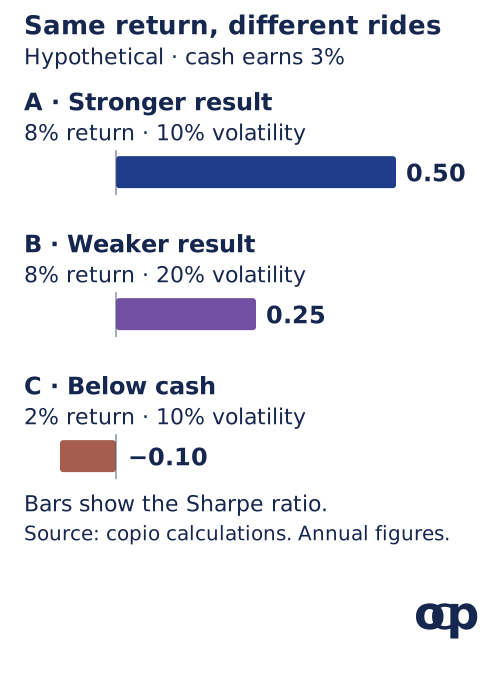
- Portfolio A: the stronger result. With 10% annual volatility, its Sharpe ratio is (8 − 3) ÷ 10 = 0.50.
- Portfolio B: the weaker result. With 20% annual volatility, its ratio is (8 − 3) ÷ 20 = 0.25.
Portfolio B's returns fluctuated twice as much without earning anything extra. Portfolio A delivered twice as much return above cash per unit of volatility. That makes A better on this measure, though both could lose money.
For a poor result, imagine Portfolio C earned only 2%, with 10% volatility. Its ratio is (2 − 3) ÷ 10 = −0.10: you accepted investment risk and earned less than cash.
There is no universal “good” score. A ratio of 1 means return above cash equals volatility; 0 means the investment merely matched cash. Compare portfolios over the same period, in the same currency, using the same benchmark and method.
How allocation works: the efficient frontier
Allocation means deciding how much money goes into each investment. What matters is how they work together: investments that move differently can reduce the fluctuations of the combined portfolio.
Harry Markowitz explained the principle in his 1990 Nobel lecture:
“It seemed obvious that investors are concerned with risk and return, and that these should be measured for the portfolio as a whole.”
The efficient frontier makes that trade-off visible. In this new hypothetical example, each point is a mix of two investments. Moving right means more volatility; moving up means more expected return. The blue curve marks the mixes offering the highest expected return at each available level of volatility. The grey mixes offer less expected return at the same volatility.
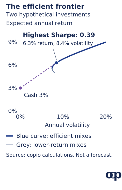
Draw a line from the 3% cash return to a mix on the curve. Its slope is the Sharpe ratio: extra return divided by volatility. The steepest line touches the highest-Sharpe mix, here about 6.3% expected return, 8.4% volatility and a ratio of 0.39. Finding that mix is called Sharpe ratio optimisation.
Notice that the curve also reaches 9% expected return, but with 20% volatility and a lower ratio of 0.30. Maximising Sharpe and maximising expected return are different objectives. Neither point promises future results: the curve depends on estimates of returns, volatility and how the investments move together.
How a major fund tracks it: NZ Super Fund
The Guardians of New Zealand Superannuation's 2025 annual report, page 45, explains:
“The Sharpe ratio enables us to compare the risk-adjusted performance of our benchmark, the Reference Portfolio, with that of our Actual Portfolio, and also against our expectations.”
For July 2010 to 30 June 2025, it reports a realised Sharpe ratio of 1.02 for the actual portfolio, against 0.81 for its reference portfolio. These are historical results; its separate long-term expectation for the actual portfolio was 0.29.
It compares returns above cash with volatility and uses annual observations to capture full valuation cycles of private assets. The report also warns that infrequent valuations can make private assets look less volatile and inflate Sharpe ratios. The lesson is to read the calculation method alongside the headline number. See how NZ Super Fund builds its portfolio.
Taleb's critique: volatility is not the whole risk
Nassim Nicholas Taleb challenges these measures in his discussion of fat-tailed markets in Statistical Consequences of Fat Tails, third edition, pages 35-36:
“Beta, Sharpe Ratio and other common hackneyed financial metrics are uninformative.”
His argument is that rare, extreme events can dominate results, while ordinary samples give unreliable estimates of averages, volatility and correlations. A calm history can therefore produce an attractive Sharpe ratio while leaving catastrophic losses largely unseen.
Volatility counts upside fluctuations as well as downside ones. It does not tell you how much you could permanently lose, whether you can sell when you need cash, or whether borrowing could force you out during a crash. For example, selling crash insurance can generate frequent small gains before one enormous loss. Optimising Sharpe does not protect against black-swan risk.
Copio's view: optimise for your wealth and your life
A higher Sharpe ratio is a comparison statistic, not a complete financial objective. Maximising it does not necessarily maximise the wealth you compound over time, preserve purchasing power, or ensure you can fund your goals. A 50% loss needs a 100% gain to recover; a complete wipeout leaves nothing to compound. Taleb's discussion of ruin, page 65, makes that survival problem central.
Our view is to set the household's goals, cash needs and capacity for loss first, then use Sharpe as one comparison tool. Review concentration, borrowing and access to cash, and test severe losses alongside ordinary fluctuations. Stress tests can expose weaknesses, but cannot rule out an unforeseen crisis. The rising-rates portfolio guide applies those questions to an inflation shock.
Sources and calculation notes
The definition and portfolio application follow William F. Sharpe's 1994 paper, “The Sharpe Ratio”. Both charts use hypothetical copio calculations, with annual arithmetic mean returns and annual volatility, a constant 3% cash benchmark, and no fees or taxes. The precise denominator is the standard deviation of returns above the benchmark; with constant cash returns, it equals portfolio volatility. The frontier combines an investment with 5% expected return and 8% volatility with one at 9% and 20%, assuming zero correlation, non-negative weights and no borrowing. It describes fully invested mixes of those two investments; cash supplies the reference point for the dashed line. The maximum-Sharpe mix is approximately 67.6% in the first investment and 32.4% in the second. The NZ Super Fund figures are reported historical ratios from its annual report, not copio simulations or forecasts.
- Simple comparison figures and assumptions (CSV)
- Efficient-frontier mixes and calculations (CSV)
- Efficient-frontier inputs and method (JSON)
Calculations checked on 15 October 2026. This article is for information and education, not personalised investment advice. Past performance is not a reliable indicator of future performance.